Showing posts with label making. Show all posts

Wednesday, 15 October 2014

Finals for physical media

after much development and different options here are our three finished and refined medias that have all been printed today!


Coffee slip (repeated three times)


Front of the flyer


Back of the flyer


Poster


Further Website Development

Bought in another liberation visual that could be used in the background, as we felt that when you scrolled right down on the home page that it got a bit boring with no colour. Played around with it being tiled but decided it looked best as a single background image along the bottom of the page to add a little more interest. 


Have now developed the resource page to be cohesive with the home page- added the selection bar and kept the same four image grid. Had experimented with the original coloured images however we found that they brought in to much random colour and didnt look as controlled. The four different images are close up, black and white shots of the transmedia piece they lead too. With an eye catching yellow tag on each image, the downloadable resources will be easy to find and access for the websites visitors. 


Added more text as well as introduced better collumns and line breaks in order to make the type more legible. Have also changed the font on the nav/ selection bar and the sub headings to Futura typeface, to keep it consistent with our other touch points.

Tuesday, 14 October 2014

Resource page

to make the home page more cohesive with the resource page, the resource page will feature a banner like the home page. Here is the development of the resource page.


Second revised option for final banner.


First revised option for final banner. 


before. this image would have featured as the entire resource page.

Revised web banner

after realising that the image of the baby was not working for the web banner (because it poked like a floating head) we have reworked it using a different image for the figure and also placing the text across the banner to better fit the format of a web page.


Before. The babies face looks as if it is floating


After. Text is bigger to ale it more prominent and image of a fair-trade worker is used to make it more relevant.

final flyer

After a few development pieces and these two options the bottom image with the chains is the final image we have chosen for the front of the flyer. The back of the flyer is soley focused on information about fair-trade and the involvement of the people at the fair-trade coffee break. we have also changed the text to "start your change" this involves the person receiving the flyer while also implying that they could do something else after the event is held.


Option without the chain illustration


Final flyer composition. the chain illustration helps in force the rhetoric and makes the image more cohesive.


Back of the flyer. This is only based on type so the receiver can be properly informed about fair-trade and how they can get involved and create their own event

Sunday, 12 October 2014

Website Development


Took away the yellow pattern from the background to simplify the overall design and to keep it more controlled and restricted. However i feel that there still needs to be something such as a illustration or pop of more colour to give it a boost.


Have changed the background colour of the container to white from black and have also edited the photos to strong black and white images to look cohesive with the other touch points and to keep the colour palette restricted.


Rearranged the layout of the type to make it more legible- achieved this by adding colomns in the HTML document.


Further Website Development

Have now added a pattern to the background of the websites home page as well as making the menu bar buttons turn yellow and the font black once you hover over them. Have also added a resource page which allows you to download the poster, flyer and coffee slip. This page also has a link to bring you back to the home page. The basic coding is now done, however there is a lot more to consider and to develop to improve the legibility of the overall website.

 
Home Page


Colour of selection bar changes once you hover over the buttons


Resource Page

Website Development


Originally we chose template 2 as the basis of our design


We got rid of the left and right column as they were unnecessary for our website as we do not have as much information to display and we want to keep our website fairly minimal so that it is easy to use and easy to locate the info you want.  

Website Visuals

These are the original ideas to use as the imagery for our website. The colours and style have remained the same to keep the different touch points consistent throughout. 


Home Page Banner

  
Resource Page Imagery

Coffee Slip Development

Below is our refined coffee slip design - once again we have used imagery that communicates the theme of liberation as well as using cultural patterns that are influenced by the countries that produce the FairTrade coffee. The colours yellow and black along with the illustration style have been used again to keep all touch points cohesive.  


Template to fit the slip design into in order for it to sit properly on the takeaway cup. 


After redesigning the slip to fit the template properly and printing out some mock-ups, i found that the text needs to be adjusted so that it is read as a straight line once around the takeaway cup. 


Friday, 10 October 2014

Flyer development


Here are a few development compositions for the front of the flyer. The most difficult thing with the flyer is making the aesthetic consistent with the trans-media elements while not arming the it with too many image since it is only A5 size, it could easily become too busy.


Playing with illustration and pattern


Adding colour and photographic montage


Adding a child, making it more consistent with poster design


Cut out of the pattern underneath image


Adding sacking texture an illustration


Adding colour to the plants, making image more cohesive


Creating circular shape our of sacking


Adding the fair-trade logo and an illustration of south america, where fair-trade coffee is grown

Poster, first final

after reworking the poster multiple times, here is our first final. We will probably need to make a few tweaks after getting feedbagck on monday but we are definitely close to a final version. Text has been added and when printed it will be A2 length but not width, giving it a longer composition space.

illustrations

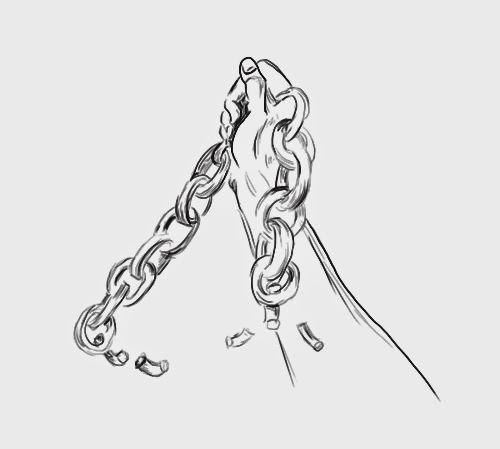
Some illustrations that could be used in the compositions, all done on the tablet.


Hand holding broken chains


Liberation protest drawing


Child crying drawing, heavy line version


Crying child drawing, light line drawing

Monday, 6 October 2014

poster development

Here is the first version of the refined poster:


The feedback we got from this poster was that the colours were not cohesive enough, the text was not prominent in terms of the image and the eyes with the cut outs were giving s confusing meaning.
After this feedback we have remade the poster in a duo tone colour.


This is the redone poster, focusing on the yellow on black and white. Although the colours in this one are more cohesive, I feel that the cut out eyes with coffee plants growing from them are more effective in grabbing attention, despite the feedback we received.


Sunday, 5 October 2014

Coffee Slip Concepts

Here are some concepts for our coffee slip design. We have used the cultural pattern to grab the coffee buyers attention and to get them to read whats on it, as generally a coffee slip can be overlooked.

With the use of bright colours it will also be more stand out and recognisable from a distance to catch the viewers eye. However, the white and yellow text could be potentially difficult to read on the printed out versions, the black is stronger and contrasts well with the orange used.