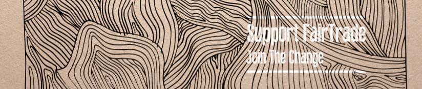
Here are some concepts for our coffee slip design. We have used the cultural pattern to grab the coffee buyers attention and to get them to read whats on it, as generally a coffee slip can be overlooked.
With the use of bright colours it will also be more stand out and recognisable from a distance to catch the viewers eye. However, the white and yellow text could be potentially difficult to read on the printed out versions, the black is stronger and contrasts well with the orange used.


No comments:
Post a Comment